Alpine restraint, Mediterranean softness
The apartment should feel poised between mountain calm and lake light, never pushed into one stereotype.
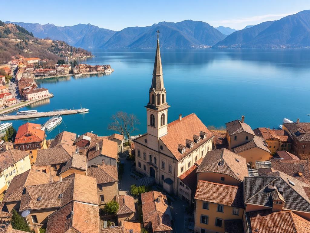
Lake Chic for Pisogne
A place-led vision for staying in Pisogne: quieter than a trend, warmer than a style exercise, and shaped by the meeting of lake and mountain.
Lake Chic begins in Pisogne, where arcades, pale stone, old plaster, lake light, and mountain edges shape the feeling of arrival.
It is not a fantasy of the lake or a decorative concept laid on top of the apartment. It is a calmer, more precise reading of the territory and its hospitality rhythm.
Alpine restraint, Mediterranean softness
The apartment should feel poised between mountain calm and lake light, never pushed into one stereotype.
Stone, olive, timber, and quiet tactility
The identity comes from plaster, stone, linen, wool, wood, and craft-like details rather than decoration.
Edited hospitality, not themed hospitality
Rooms should feel precise, breathable, and memorable without becoming theatrical or over-styled.
Atmosphere over spectacle
The goal is calm confidence: fewer gestures, better materials, and a stronger sense of belonging.
Lake Chic is not about spectacle. It values calm confidence, edited rooms, durable materials, and the quiet refinement of a handle, a ceramic bowl, a polished timber edge, or a linen curtain moving in soft light.
Its palette comes from place rather than trend: Botticino cream, deep teal water, olive foliage, chestnut timber, fresco terracotta, and the denser plum of porphyry.
At its best, it feels local without becoming rustic, contemporary without erasing place, and elegant without becoming formal.
The identity shifts with the lake across the year. The base stays calm; only the atmosphere deepens or lightens.
Fresh stone, flowers, wet arcades, and lifted green-blue notes.
Chalky surfaces, cane, pale linen, brushed stone
Olive paths, early flora, soft lake mist
Sharper light, white boats, deeper water, and more visual air.
Crisp cotton, rope, honed surfaces, and controlled contrast
Shade, promenade rhythm, and reflected brightness
Olive harvest, chestnut warmth, and denser terracotta-plum accents.
Boucle, smoked glass, terracotta stoneware, darker woods
Mild October light and quieter lakefront scenes
Dark water, snow-capped peaks, thicker texture, and warmer light.
Felt, wool, stained timber, parchment shades
The palette stays pale; the warmth comes from atmosphere
The palette is curated, not decorative. Cream and teal lead; sand, sky, olive, terracotta, plum, and brass support the stay in measured doses.
Primary anchor
Use for primary actions, headings, strong navigational anchors, and darker editorial panels.
Main light field
The calm base for page backgrounds, generous spacing, and the quiet hospitality tone.
Secondary natural accent
Best for restrained tags, seasonal depth, and material cues tied to groves and hills.
Warm neutral support
Use as panel fill, soft card background, or tactile neutral surface, never as light text.
Warm CTA accent
Reserve for selective calls to action and warm editorial emphasis.
Evening or premium accent
Useful for quieter premium moments, footers, and small atmospheric touches.
Soft panel color
Best for secondary cards, palette moments, and lighter blocks, not body text.
Metal highlight
Keep this for narrow highlights, hardware-like details, and small graphic notes.
The most faithful version of Lake Chic comes through tactile choices rather than overt styling.
Matte plaster-like finishes and Botticino-inspired stone surfaces
Washed linen, cotton, and wool for breathable comfort
Timber tones that feel chestnut, walnut, or oak rather than glossy resort wood
Cane, rope, and open-weave references that nod to local craft without becoming thematic
Small brass or bronze notes used like hardware, not decoration
For guests, this means an apartment that feels edited rather than busy: quieter surfaces, stronger material cues, and a sense of ease that is linked to Pisogne itself.
It is a way of staying that privileges atmosphere over performance, texture over ornament, and belonging over themed vacation styling.
Based on the Lake Chic for Pisogne internal brand reference.
See how the palette and mood translate into the living area, bedrooms, kitchen, and booking experience.